I’ve been struggling to get an Australia Map with Label in Power BI, finally I crack it and I just want to share my experience to you guys.
Limitations and Problems I met:
- Existing Map function in Power BI can’t show label.
- Packages like
map,worldmapsupported by Power BI service have NO Australia state boundaries data. oz packagein R includes state boundaries data, BUT Power BI service doesn’t support this package, and we can’t directly use it withggplot2.- Drawing a map in R-studio is all good with prepared map data, but the map is teared up in Power BI by using the same code.
Step1: Collect Australia state/coast boundaries data
Based on a lot of googling, I find this great post, Etienne Laliberté has already helped us to converted ozRegion() data to a data frame that can be used in ggplot2, which is super. So, download ozdata.csv file.
Becuase There is no ACT state boundaries in this data, I found official ACT data from data.gov.au. I spent a lot of efforts here to convert shp to csv file here, all failed. If you understand this kind of data type conversion, just use it.
You can also consolidate an Australia map based on data.gov.au directly.
What I did are
- Click the third link to get JSON file

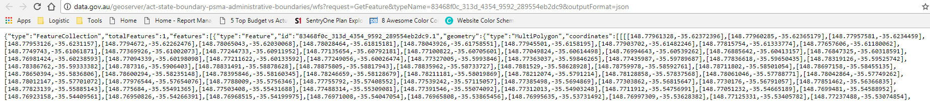
-
Convert JSON to CSV
I used an online conversion tool to do the job, just easily copy and paste. -
Merge the file
Copy Column F and G toOzdataLong and Lat column, keep the same order as you download the converted file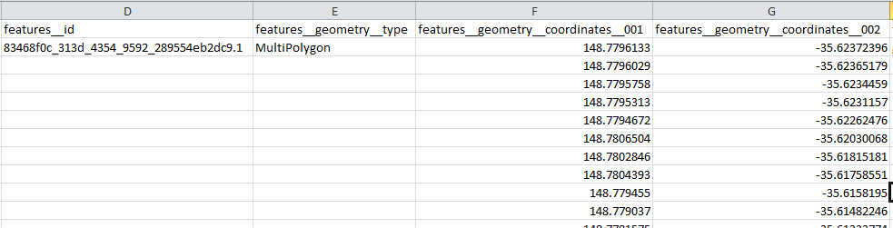 Fill group column with
 8; fill order column from1to the end of this group; fill region asACT; fill border asACT.NSW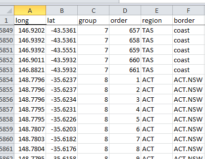
Till this step, I generated a complete Australian state/coast boundaries data. - Test in R-studio
>library("ggplot2")
>ggplot()+geom_polygon(data=ozdata_with_ACT,aes(x=long,y=lat,group=group,fill=region))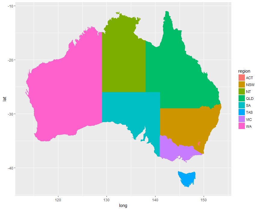
Don’t haveggplot2library? Just typeinstall.packages(“ggplot2”)in R-studio
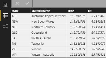
Step2: Prepare label position data
The logic of labelling the map is overlaying two layers. If we want to overlay a label to map, we need get one position in each state which is the coordinates (long,lat), so we need create a csv file and upload to Power BI as below screenshot.
I slightly changed the long and lat for ACT, NSW and VIC, because they are very close and the labels will be overlaid by each other.
Then, all the external data are ready!
Step 3: Prepare your data.
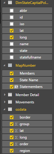
Because the state in map data is not unique, to avoid multi-multi join, I create a calculated table
MapNumber = SUMMARIZE('Member Detail','Member Detail'[State Name],"Members",sum('Member Detail'[NumberofMember]))
Step 4: Build up relationship between datasets

Step 5: Start your R coding journey
Insert R tile in Power BI, and select the data we need
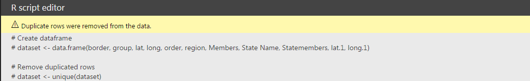
Coding in R script editor
#Load ggplot2 library
library(ggplot2)
#Order dataset!! this is the step I have been struggling for a very long time, if there is no order the map you get will be teared up
new<- dataset[order(dataset$group,dataset$order),]

#Power Bi will consolidate all data as one data frame, to improve performance, create a label data frame with unique label position and content data.

label<- unique(dataset[,c("Statemembers","lat.1","long.1")])

#Draw the map layer, using “scale_fill_gradient” to select the colour you want to show in the heat map

ggplot()+geom_polygon(data=new,aes(x=long,y=lat,group=group,fill=Members), colour="white")+expand_limits(x = new$long, y = new$lat) +coord_map()+ scale_fill_gradient( low = "#add8e6", high = "#466BB4")

#Draw the label layer

+geom_label(data=label,aes(x=long.1, y=lat.1), colour="#4A4A49", fill="white", label=label$Statemembers, size=4)

#Theme, I like pure white and clean background, you could configure your own one you like

+theme(panel.background = element_rect(fill = "white", colour = "white"))+ theme(plot.background = element_rect(fill = "white",colour="white"))+ theme(

 panel.grid.major.y = element_blank(),

 panel.grid.minor.y = element_blank(),

 panel.grid.major.x = element_blank(),

 panel.grid.minor.x = element_blank()

 )+    labs(x=NULL, y=NULL) +  theme(axis.ticks = element_blank()) + theme(axis.text = element_blank())+ guides(fill=FALSE)
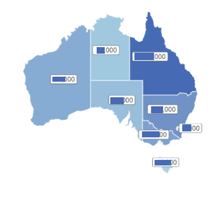
Then I got this, the problem is I can hardly tell the difference between states except QLD from the color
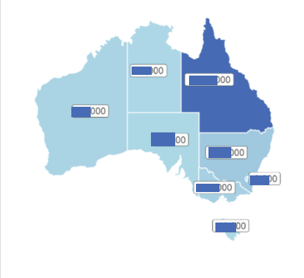
What I did is to modify the map layer as
ggplot()+geom_polygon(data=new,aes(x=long,y=lat,group=group,fill=log(Members)), colour="white")+expand_limits(x = new$long, y = new$lat) +coord_map()+ scale_fill_gradient( low = "#add8e6", high = "#466BB4")
Let’s have a look at the final output.
Have Fun!